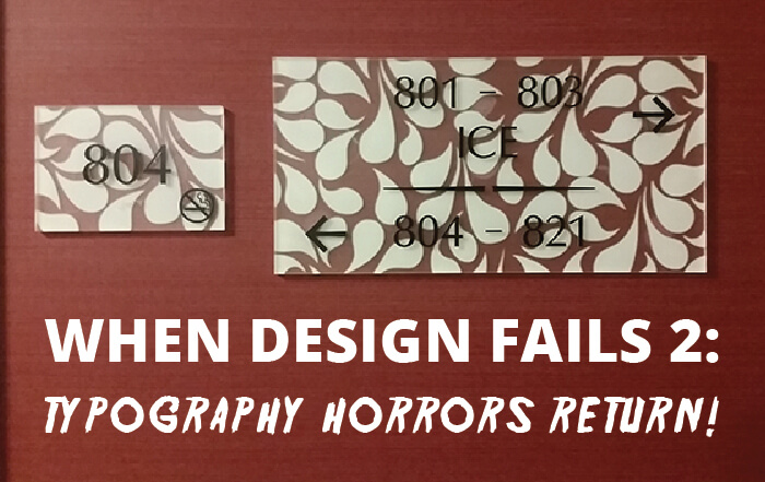
DESIGN FAILS II

We had a lot of feedback from our first post on Design Fails, many of you sent in your own which has led to us doing a volume II. Hope you enjoy this collection of design fails, many of which simply make no sense how they came to be! If you have your own, please send in and we will include in a future Volume III

design-fails-vol-II (7)

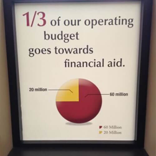
Graphics: The longer you look at this, the more wrong it becomes

design-fails-vol-II (6)

Safety: Our new safety protocol is simply to never ever have a fire.

design-fails-vol-II (5)

Signage: This is why you need a designer! So Joe from Accounting doesn’t make something like this while trying to be creative.

design-fails-vol-II (4)

Signage: Good luck getting through the front door here.

design-fails-vol-II (3)

Ornament: Anyone else do a double take? I wouldn’t want this in my Christmas tree.

design-fails-vol-II (2)

Watch: The more often you check this watch, the more likely you are to be late.

design-fails-vol-II (1)

Book: What type of nut would you call this?

design-fails-vol-II (32)

Wayfinding: So… left to park? Or right? I’ll just drive in a circle and hope for the best.

design-fails-vol-II (31)

Signage: I think they may have forgotten one crucial piece of information…

design-fails-vol-II (30)

Signage: Sometimes design just needs a human touch, relying on the internet can leave you with, well, this.

design-fails-vol-II (29)

Elevator: Maybe I’ll just take the stairs… my eyes hurt just looking at this.

design-fails-vol-II (28)

Signage: Pay before existing? This is truly found peak capitalism.

design-fails-vol-II (27)

Signage: I hope you’re not in a hurry, I don’t know how anyone finds their room with signs like these.

design-fails-vol-II (26)

Signage: Good luck getting very far on this bike ride.

design-fails-vol-II (25)

Advertisement: Example A in why it’s important to know where exactly your design is going.

design-fails-vol-II (24)

Signage: I’ve heard of bike-friendly cities, but this goes a little too far.

design-fails-vol-II (23)

Escalator: I think there was a slight error in the architectural plans.

design-fails-vol-II (22)

Home Improvement: DIY isn’t the answer for everyone.

design-fails-vol-II (21)

Toys: Poor Cinderella, this is really not her best angle.

design-fails-vol-II (20)

Signage: The only thing this sign helps you achieve is confusion.

design-fails-vol-II (19)

Labeling: I’m a bit hungry, how about a quick snack of chewable hair, skin and nails?

design-fails-vol-II (18)

Advertisement: This poster makes me doubt just how valuable their apprenticeships in graphic design are…

design-fails-vol-II (17)

T-Shirt: So, is it me? Is it you? Who can tell with this shirt.

design-fails-vol-II (16)

Website: There’s bad photoshopping, and then there’s this…

design-fails-vol-II (15)

Graphics: So, in this diagram, your values include just a little trust, partnership, innovation, and performance? I think I’ll take my business elsewhere.

design-fails-vol-II (14)

Flyer: You can’t just sprinkle words around artfully and hope it makes a sentence.

design-fails-vol-II (13)

Signage: I also like to start my Sunday at Churrch.

design-fails-vol-II (12)

Menu: Yes, I’d like to order a – child rib??

design-fails-vol-II (11)

Van Wrap: I guess the driver isn’t a coffee drinker.

design-fails-vol-II (10)

Cup: Nothing says romance this Valentine’s Day like “Hell Love.”

design-fails-vol-II (9)

Signage: As much as I love funnel cake, I’m afraid I’ve suddenly lost my appetite…

design-fails-vol-II (8)

ATM: This is a bank that thinks you need to really work for your money every step of the way.

It is due to horrendous mistakes like above that we ensure with every order we send an elevation for confirmation before going to print. This demonstrates just how the graphic will look and line up with your wall.

Browse Products